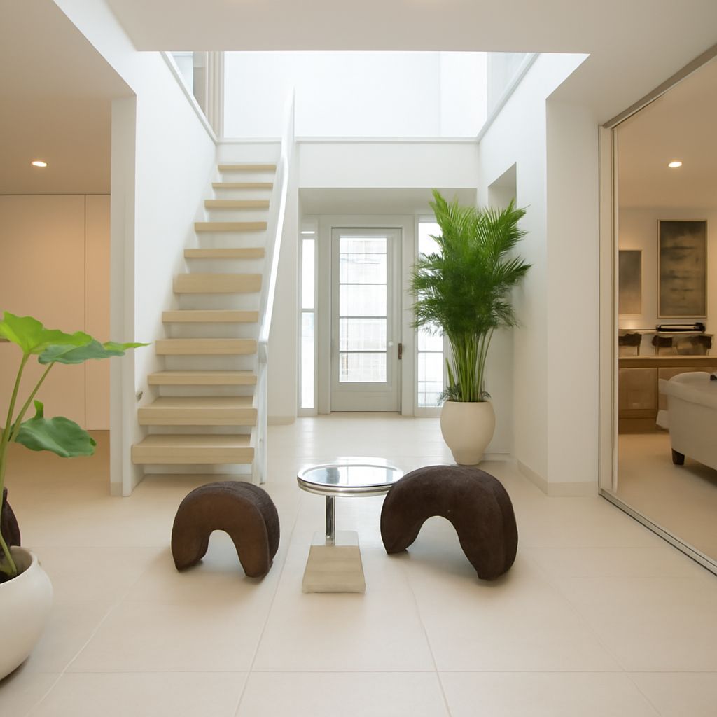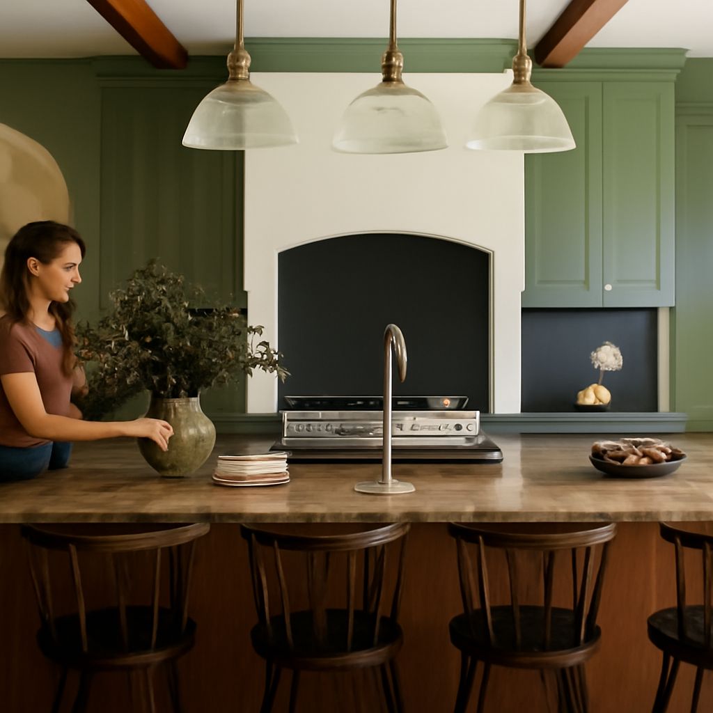
The right shade depends on the light and the surfaces already in the room. A sunny room with warm wood can make a color read differently from the same paint in a shaded room with gray tile. Start with a green wall paint that suits those conditions, then test it before buying gallons.
For a house painted green, a bedroom may call for a muted shade, while a front door can carry a vivid one. A screen is handy for gathering ideas, but its color is not a promise of how the finished surface will look.
Green house paint: read the undertone
Put several green paint chips against a white sheet. A yellow-leaning green can appear olive or grassy beside a blue-leaning shade, which may look more like eucalyptus or teal. Gray can soften either direction. These comparisons reveal differences that are easy to miss when you look at one chip alone.
Start with what cannot easily change. Honey-colored oak may look comfortable beside an olive or sage shade, while a blue-green may make the wood’s warmth more prominent. Neither combination is automatically wrong: decide whether you want contrast or a quieter relationship. Hold the sample beside the actual floor, countertop, tile, and trim, not just a photograph of them.
For green house paint on an exterior, compare samples with the roof, masonry, and surfaces that will remain. Brick may contain several colors; choose a shade that works with the whole wall rather than matching a single brick. View the green exterior from the street as well as up close. Sun, shade, and neighboring buildings can change the apparent balance across a facade.
Separate brightness from intensity
A pale color reflects more light than a dark one, but pale does not always mean subdued. A light, clear lime can feel lively; a darker, grayer olive can feel restrained. Compare how light or dark each sample is separately from how vivid or muted it looks. That gives you two useful controls instead of one vague choice between bold and safe.
Bright green paint can energize a small entry or a piece of furniture. On every wall of a large room, the same color occupies much more of your field of view. If you like its character but want less intensity, compare it with a grayer version at a similar lightness. If you want a stronger accent, use the vivid green finish on a door or a single defined surface and connect it to a calmer surrounding color.
Dark shades can create a sense of enclosure that suits a reading room, but they also make the contrast with white trim more pronounced. In a room where you need to judge food, clothing, or craft colors, consider how much light you have at the times you use it. A pale sage may feel gentler in a dim room, while a deep forest tone may be exactly the atmosphere you want in an evening space.
Follow the light through the day
Place your samples where the finished color will actually appear. A wall opposite a window can receive a different mix of light from the wall beside it. Direct sun, overhangs, trees, and window treatments all affect the view. Reflected foliage can tint pale paint colors green, so a leafy view deserves a place in the test rather than an assumption about compass direction.
Look in the morning, afternoon, and evening, with the lamps you normally use switched on after dark. Benjamin Moore recommends viewing samples under natural and artificial light. If a shade looks pleasantly warm by day but too yellow at night, compare another with a cooler undertone before changing the whole lighting plan. Note the bulb and fixture as well as the color: replacing either later can alter the result.
Build a small, workable palette
Choose one dominant wall color, then test a trim color and one accent against it. Creamy trim may echo warm stone or wood; a cooler white can sharpen the edge beside a blue-green. Place the chips directly against each other and against the existing materials. A white that looks neutral in isolation may reveal pink, yellow, or gray beside its neighbor.
When selecting paint for a green home exterior, use the main siding color as the largest sample, then compare the trim and door in smaller areas. A saturated green coating can work on a front door even when it feels too insistent across the siding. Inside the green-painted house, carry a related undertone into an adjoining room through a neutral or textile.
A finish affects appearance too. Sheen changes the way a surface reflects light and can reveal wall imperfections. Ask the retailer for the intended product and sheen, and check the sample against the final specification. Benjamin Moore notes that applied color can vary with product, sheen, and lighting; its liquid samples are intended for color testing, not as a final coating. A few sample purchases cost less than repainting a room.
Make the comparison at home
Narrow your selection to two or three candidates. Brush two coats of each onto separate white boards, following the sample instructions, and label the backs. Benjamin Moore suggests white foam board for movable samples; let the coatings dry before comparing them. Keep a white margin between colors so their edges do not dominate the judgment.
Move the boards beside the trim and floor, then onto both a bright wall and a shaded wall. Stand back as well as looking close. For a house color in green, take the boards outdoors and view them near the fixed exterior materials in sun and shade; use a sample method suitable for the product. If you plan to prepare old painted surfaces, EPA advises that homes built before 1978 may contain lead-based paint; address that before disturbing the coating.
For the final choice, place a yellow-leaning sage and a blue-leaning sage beside the same trim and floor. Compare both boards in morning daylight and again under your evening lamps; choose the one whose undertone and intensity you prefer in both conditions.